Situation
Overview
The Cell Phone Offices has contracts with three carriers to offer cellular devices to users for department and or personal use. The clients had two separate websites. A static site to promote the offerings, and a web application to manage processing customer requests and billing. Both systems required a lot of maintenance and had not ability expand for growth. Jumping between different sites created a poor user experience. We met with key stakeholders to discuss creating a new product to meeting their current needs as well as plan for future growth.
Challenges
Few resources dedicated to the project. To overcome this we worked with a third party to add additional developers to the project. This helped us increase the velocity of each sprint. We also learned from each other how to improve our documentation and development processes.
My Role
UX Design Manager / Product Owner
- Work with stakeholders to establish the goals and specs of the project.
- Assist in writing documentation for the project.
- Liaisons between stakeholders, developers, and end-users.
- Manage the design, development, and testing of all UX elements.
Task
Project Goals
- Increase the capacity of customers the Cell Phone Office can manage by automating existing processes.
- Improve user experience while adhering to the university brand.
- Reduce the number of non-payment occurrences from users.
- Reduce ongoing maintenance requirements from developers.
Action
Research
Getting to Know the Users
We identified three main user groups by how they would interact with the site. Cell Phone Office Employees are users working in the Cell Phone Office who needed admin functions to update the site and manage accounts. Department Plan Managers are users who managed business accounts for their department. Personal Plan Managers are users who managed personal accounts.
Personal & Department Plan Managers had very similar needs and pain points. Department Plan Managers had additional needs such as the approval processes for department devices and transferring devices between employees.
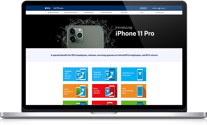
Through our research we learned one of the most important requests a user would make on the site was choosing a new device. The most important questions they wanted answered were "What devices are available?" and "How much will it cost?"
Selecting a Device
We wanted to make sure we nailed the most common experienced of the web, selecting a device. We started our experience with users selecting a device on the the first page and the second page would allow users to select more options for the phone and plan.
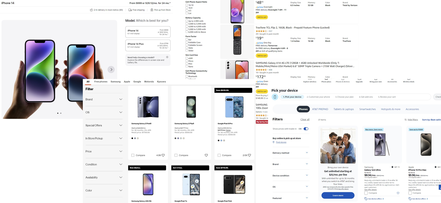
Competitive Analysis
Evaluating various sites with similar functions validated our initial design assumptions.
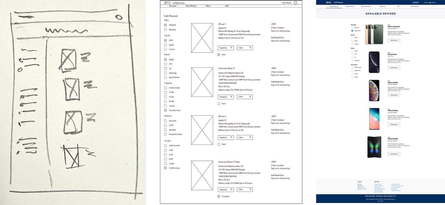
Design Workflow
Example of the the how pages develop from sketches to wireframes to mockups.
Iterations
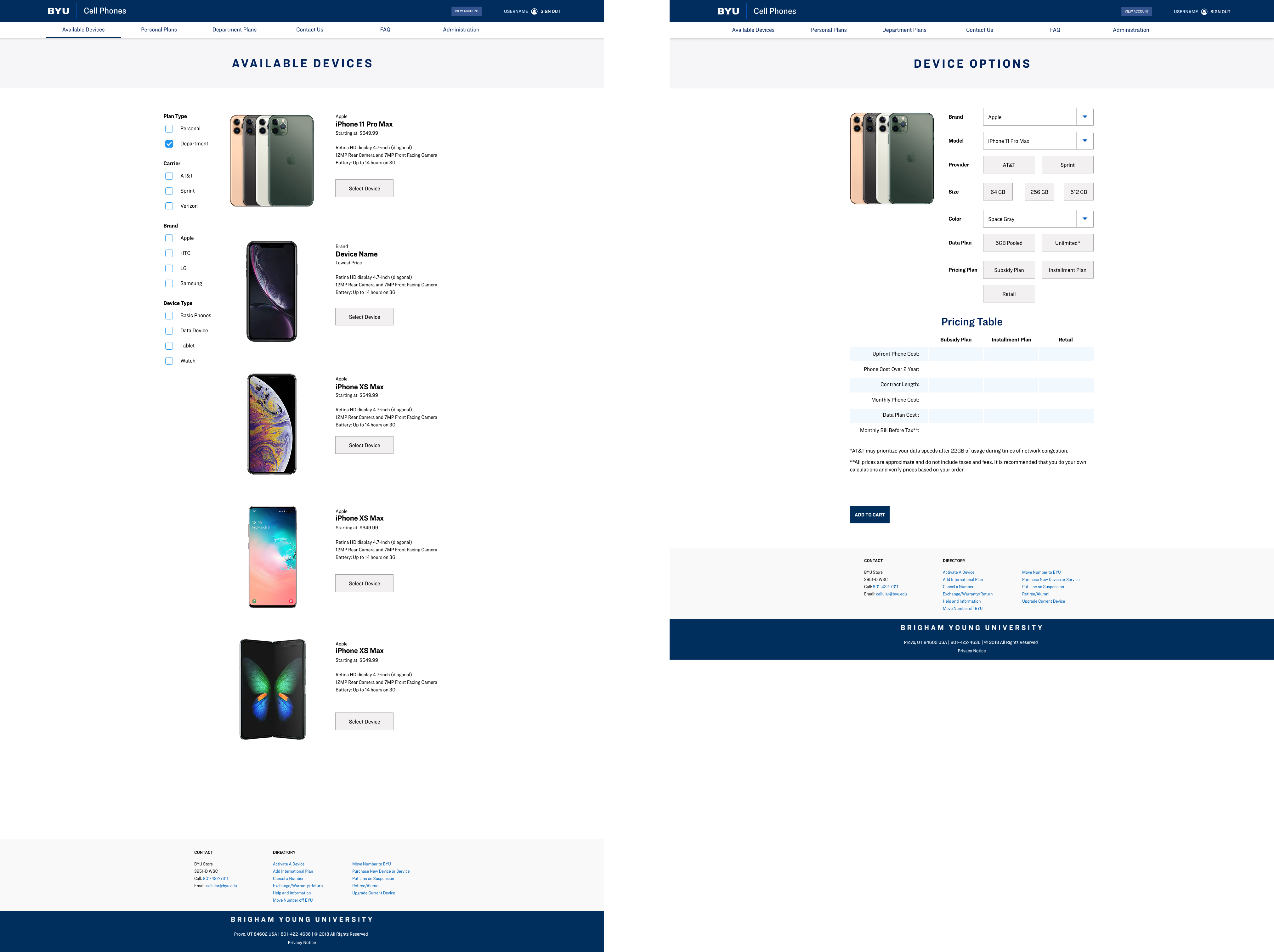
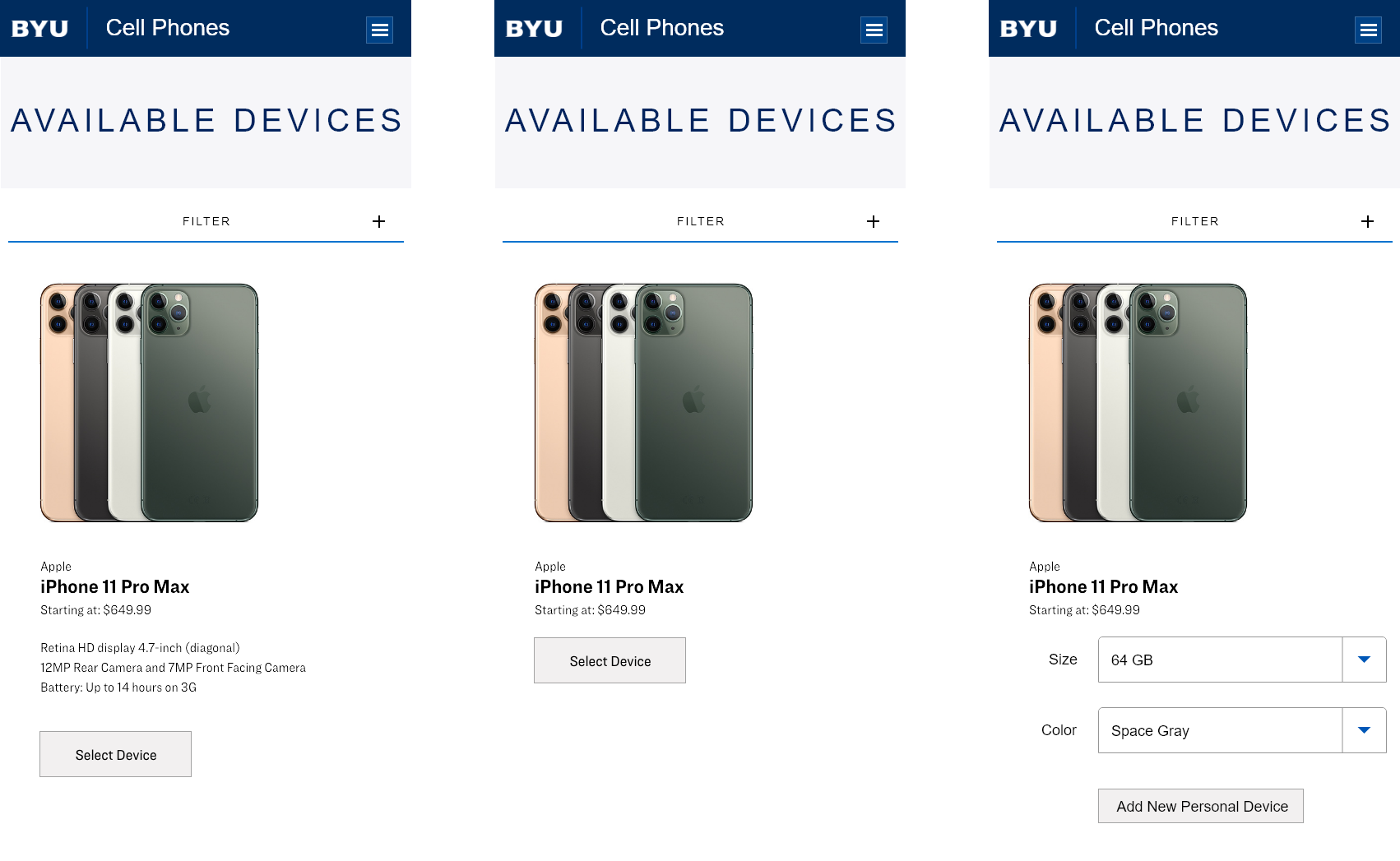
The first page “Available Devices” needed to display enough information about a device to select it and move on to the “Device Details” page to complete selecting the phone, provider, and plan options.
Evolution of design changes made from after performing end user testing.
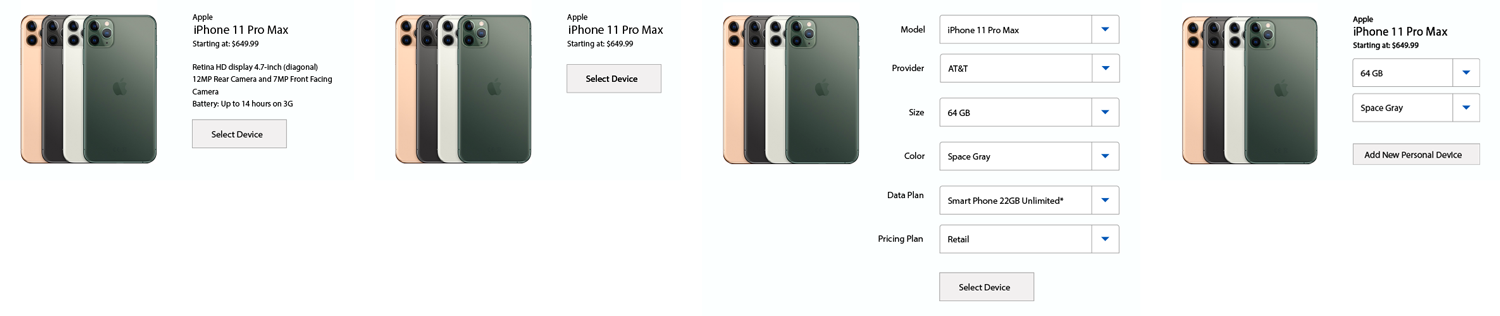
Though user interviews we learned that many of them already knew which phone and provider they wanted, or didn’t care about product details. We tried moving all of the options on the “Device Details” page rather than the “Available Devices” page. This caused users to move back and forth between the two pages looking. We learned the users place high value on the color and memory size available. The final version included only color and memory size options. This provided users with enough information to move forward in the process.
On the Device options page the user would select more options as well as change previous selected options.
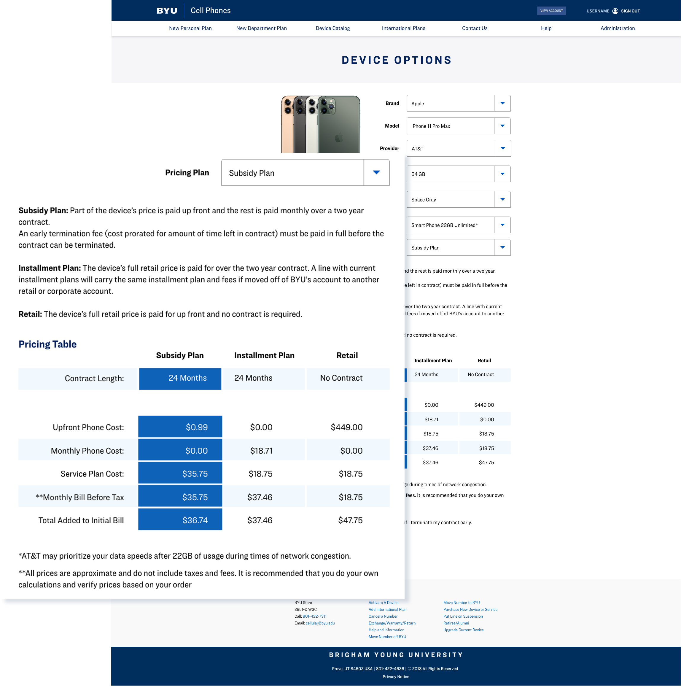
Corporate plans are different from your typical consumer plan. Everyone has the same billing date. This caused a lot of confusion for their customers about what would appear on their first bill. The price could vary greatly depending on when in the month an order was placed and when the phone was activated. We refined a pricing table to help improve clarity and reduce call volume
Automating Processes
We started by started by mapping out over 40 processes to find areas we could improve, automat, or eliminate. Nine manual process were identified which we felt could be automated by implementing APIs for the carriers.
Over 40 processes were mapped out to find areas we could improve, automat, or eliminate.
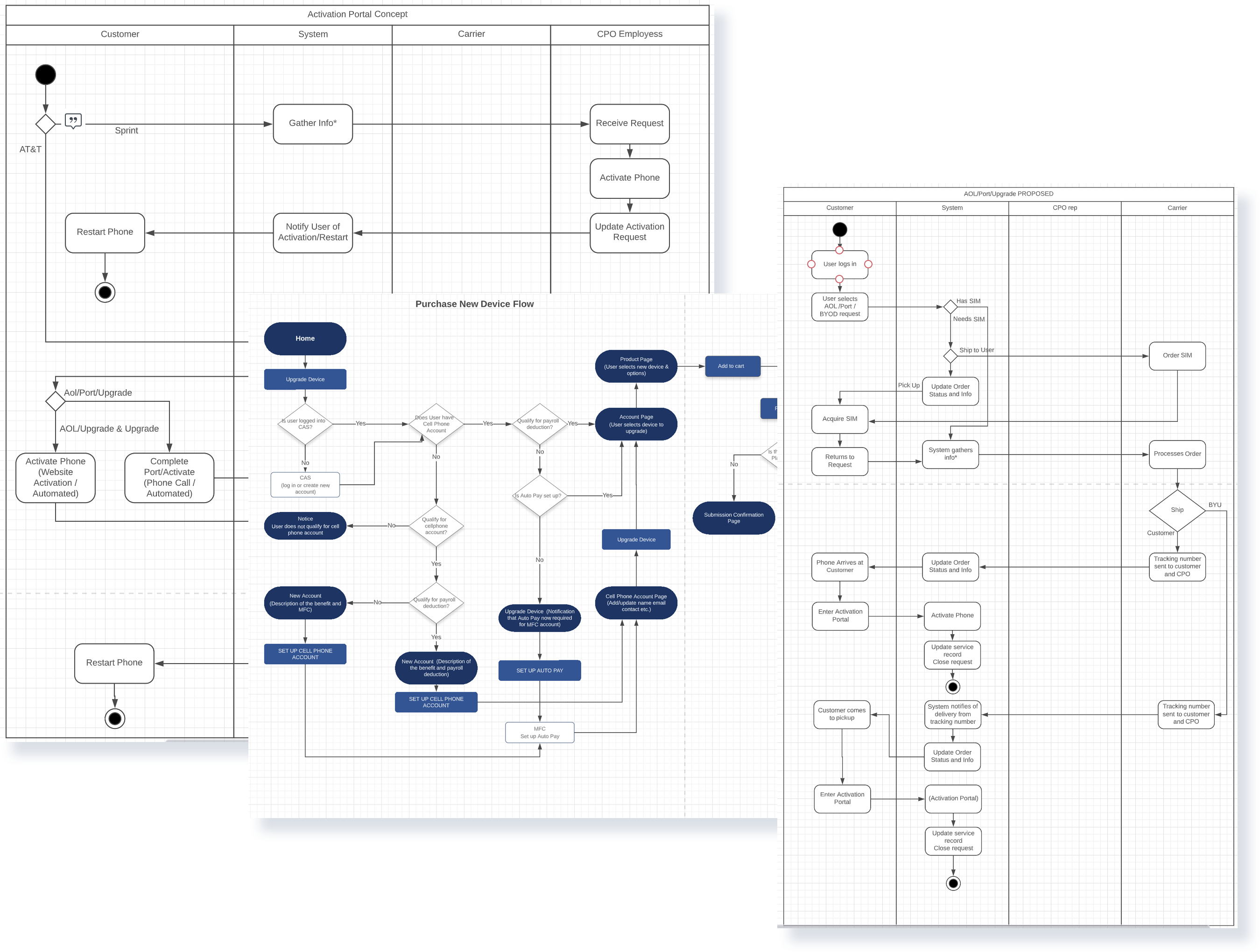
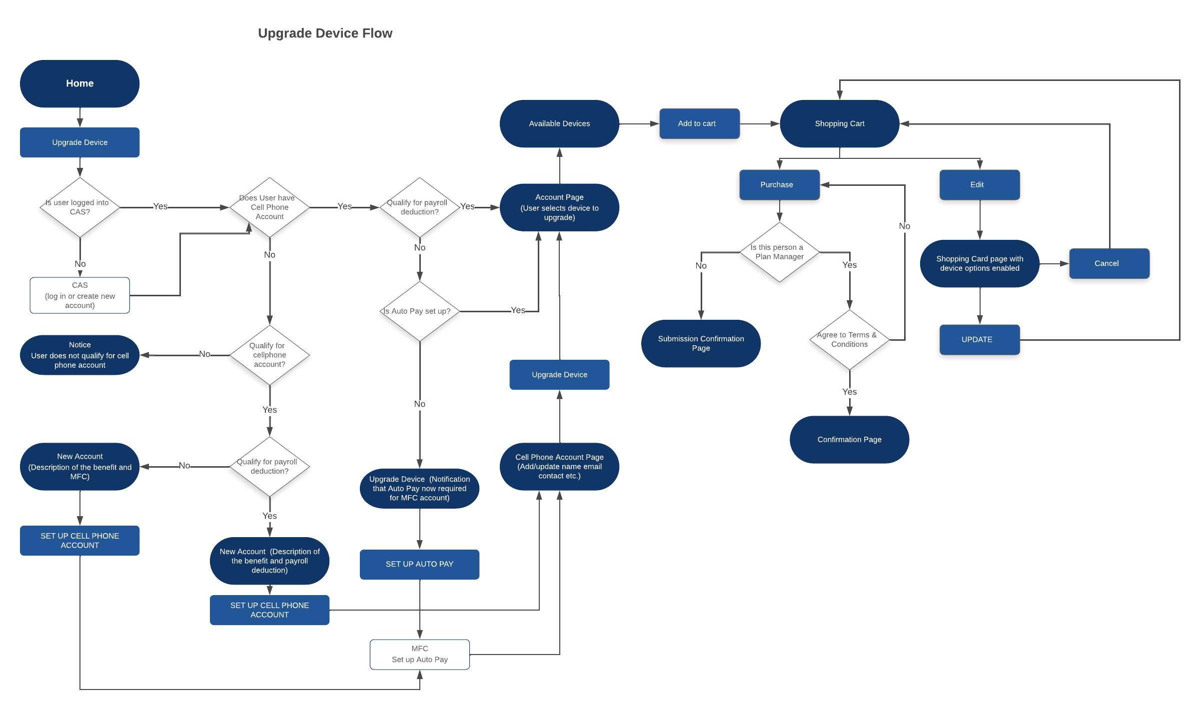
Example of an automated process to upgrade a device.
Results
Improved User Experience
- Interface brought up to branding and identity standards.
- Web accessibility standards were implemented.
- Contend organization improved.
- Provided clarity and transparency to billing information and order request status.
Reduced Maintenance Time
- Robust billing system to handle growing user base.
- Admin portal to reduce developer involvement and expedite changes from customer.
Reduce Processing Time for Customer Requests
- Integrated APIs with career's which reduce workload of the customers staff.
- Reduced errors by replace in manual processes.
- Reduce calls from users related to updates about requests and billing information.
What We Learned
Testing Assumptions
We made assumptions about a particular API. Main that it would be to obtain and implement. This led to long delays as we encountered unexpected roadblocks due to poor API documentation and issues replayed to maintaining active keys and permissioning. Had we tested the API sooner we would have been aware of work involved and planed more recourses to resolve this roadblock.
Keeping things on track
A big part of this project was identifying what features are critical at launch for both customers and end users. To avoid feature creep we took the following approach to evaluate what should be included.
Proposed Feature: Allow end users to upgrade multiple lines in a single request.
| Resources required to implement | High |
|---|---|
| Importance to end users | Low |
| Importance to customer | High |
| Critical to launch | Low |
While the customer thought this would be a beneficial feature for the end users, our user research didn't come to the same conclusion. The amount of resources required to implement the feature could jeopardize the proposed launch date. It was determined this feature would not be included in the launch and could be reevaluated for possible feature in a future release.